My works

livrichy website
code reflection website
APL website
VKO tobacco website

REDESIGN

ENHANCING USER EXPERIENCE

GMAIL

User stories

1. As a Gmail user, I want to have pagination natively accessible so I can search more efficiently.
2. As a Gmail user, I want to see many more emailsto get through them quicker.

The problem

Considering all available search options in Gmail like , in some cases the best way is to use a manual scroll search. Pagination controls in Gmail are located in the top right corner, making them easy to overlook. Users may find it unintuitive to navigate through a large number of emails as they might expect pagination at the bottom or more visible within the main interface.
Overview
In today’s fast-paced digital world, notifications and emails often pile up, creating an overwhelming user experience. This is especially true for Gmail, one of the most widely used email platforms globally. Many users manage their inboxes across devices, but the mismatch between desktop and mobile workflows often leads to frustration. For instance, after skimming through emails on a desktop, users frequently rely on recognition memory to sort through the same notifications on their mobiledevices—a tiring and inefficient process.
Gmail analysis
Heuristic Analysis of Current Design
Visibility: The pagination controls are less visible and might be hard for users to locate, especially those used to bottom-pagination layouts.

Efficiency: For users who scroll to the bottom of the page, it’s inefficient to move back to the top right corner to navigate.

Learnability: The location of pagination isn’t consistent with common design patterns, which may confuse first-time users.

Frustration: Users, particularly those dealing with a high volume of emails, may experience frustration due to the difficulty in locating and using the pagination controls.
Pain points
Key Pain Points:
· Hard-to-find pagination controls.
· Additional steps needed to navigate, impacting usability and time efficiency.
· Potential frustration, especially for users managing a high volume of emails.
Competitors research
Competitors research shows that Outlook and Yahoo are using infinite scroll.
Competitors research Outlook
Outlook
Competitors research Yahoo
Yahoo
Eye-tracking and scanning pattern
According to a Nielsen Norman Group (NNG) eytracking research there are 4 patterns that people use to scan text on the web:
· F-pattern
· Spotted pattern
· Layer-cake pattern
· Commitment pattern
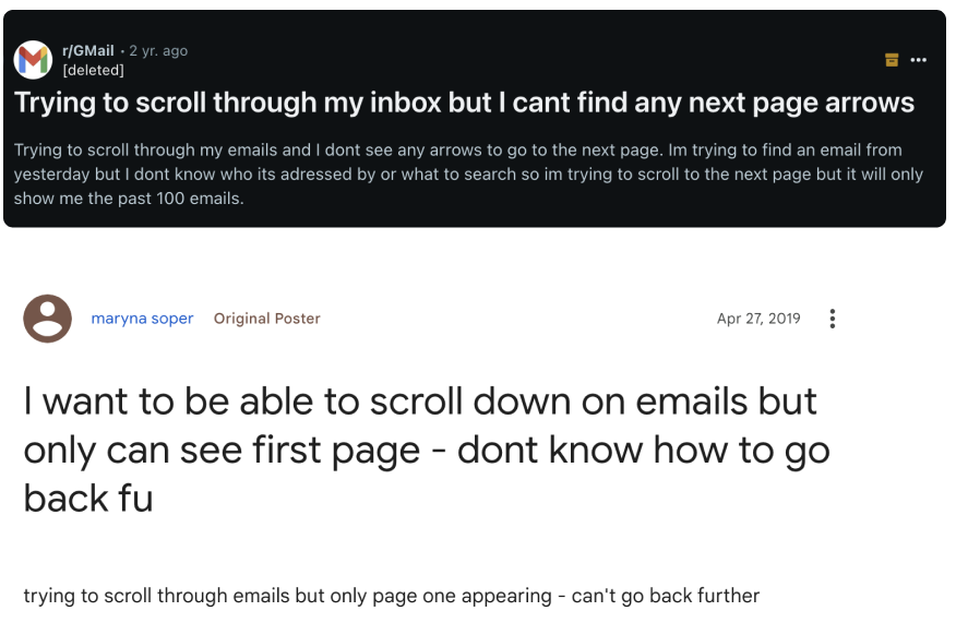
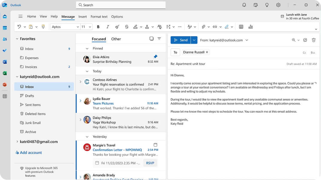
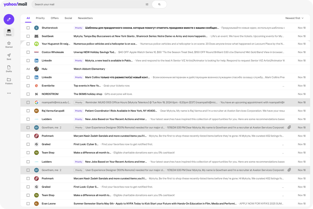
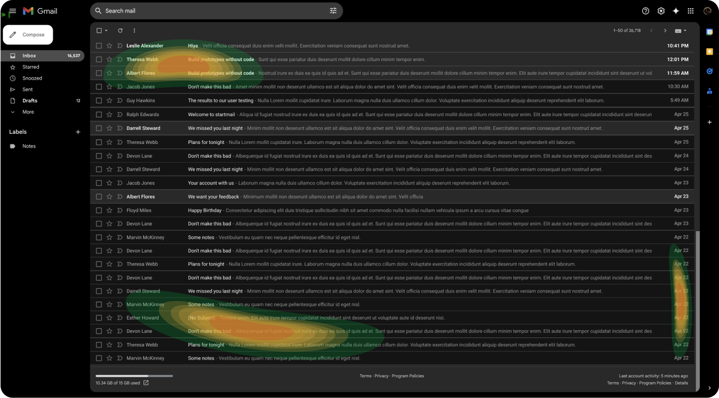
Based on NNG research, I’m able to identify that current UX case is where the user focuses on words and date that resemble a word that the user looks for to accomplish the current task, which means that the spotted pattern is used.
While user is searching for the right word, the most focused area would be accumulated at the bottom  where the sender’s name, email subject, text, and date will appear. And to locate the pagination at that area seems reasonable.
User flow
User flow map outlines the user’s journey during the manual search of the email.
User Flow
Storyboard
Imagine a situation:
Today is Friday. 
Mike received an email invitation to event from some colleague during this week. 
Mike does not remember the address but he has to leave soon. 
Mike doesn’t remember senders nickname and subject of the message, but he knows that if he’ll see it he will recognize it. 
He does not starred or flagged it. 
The only option is to scroll through his emails real quick.
Storyboard Big picture
Storyboard Close-up picture
Usability study
The task for testers:
You received an email invitation early this week. You don’t remember senders nickname and subject of the message, but you know that if you’ll see it you will recognize it. You do not starred or flagged it. The only option is scroll through your emails real quick, where will you look for pagination?
I have printed the Gmail page and pagination separately so users can place the pagination where in their opinion is the right place to have it.
Usability study LO-FI prototype
User testing answer
User testing answer
User testing answer
User testing answer
Prototyping
Hi-fi prototype testing (remote unmoderated prototype study)
Findings: the dropdown can be exposed, considering all the space on the bottom row.Also adding UI prominence to this feature would be helpful.
Iteration #1
Findings: the dropdown can be exposed, considering all the space on the bottom row.Also adding UI prominence to this feature would be helpful.
Iteration #2
The prototype is available on desktop or by this link.
Findings: the results of the testing are documented in the table below.
Second iteration result of prototype
Next steps
During this project, Gmail’s pagination, identified pain points through user stories and heuristic analysis. Conducted research and eye-tracking patterns show that there are three possible pagination types to consider: pagination, load more, and infinite scroll. Pagination audit and user flow helped to create and facilitate the usability study of paper and digital prototypes which led to multiple design iterations.

User research shows that a good solution would be to move pagination to the bottom and add a dropdown with the number of emails per page changer. Adding UI prominence is also good to consider.
The best solution would be to use infinite scroll
Iteration #1
More projects on Bēhance

My works

livrichy website
code reflection website
APL website
VKO tobacco website